
Parallax Effect in Android

In recent times, every application in Android is giving more importance to user experience. An app with a good user experience will have good user ratings and popularity. To provide users with a good experience, many effects are available in the UI/UX space. One such effect is Parallax. Let’s understand what this is about and also an app sample to know how to use it.
This blog covers,
- What is Parallax?
- Implementing the Parallax effect in Android App
What is Parallax?
Parallax sounds like a mathematical word. Yes, this technique has been derived from the Mathematical principle itself. It's a technique in computer graphics and web design, where background images move by the camera slower than foreground images, creating an illusion of depth in a 2D scene and adding to the immersion. Parallax scrolling can be a really interesting technique to use to give parts of your app a bit more life and character. It's not restricted to android/web-apps. Most of the gaming applications use this effect to give an effect of objects moving back with only one object in focus.
Parallax in Android will come under material design scroll animations. Some designs include a parallax scroll effect with a header image, along with Tabs. We will look into the same type of parallax example in this blog.
Implementing the Parallax effect in Android App
Let’s first create a new project
- Start a new Android project
- Select Empty Activity and Next
- Name: ParallaxAndroid
- Package name: com.mindorks.example.parallax
- Language: Kotlin
- Finish
Let’s add the required dependencies.
implementation "androidx.coordinatorlayout:coordinatorlayout:1.1.0"
implementation 'androidx.recyclerview:recyclerview:1.1.0'
implementation 'com.google.android.material:material:1.2.0-alpha06'
Now, the project is ready.
Here, we will be creating an app to display a list of books with a parallax scrolling effect. Let's start with the XML layout. Firstly we need to have a collapsing toolbar layout which we can add to the main activity XML. Collapsing toolbar layout is like a FrameLayout. Whatever element was added in the last, those elements will be placed at the top. This positioning is very important to get parallax to work properly.
Let's see the skeleton of the activity_main.xml and then later add the required element code.
<androidx.coordinatorlayout.widget.CoordinatorLayout>
<com.google.android.material.appbar.AppBarLayout>
    <com.google.android.material.appbar.CollapsingToolbarLayout>
        <ImageView/>
        <android.appcompat.widget.Toolbar />
        <com.google.android.material.tabs.TabLayout/>
    </com.google.android.material.appbar.CollapsingToolbarLayout>
</com.google.android.material.appbar.AppBarLayout>
<androidx.viewpager.widget.ViewPager/>
</androidx.coordinatorlayout.widget.CoordinatorLayout>
Our activity_main.xml will look like,
<?xml version="1.0" encoding="utf-8"?>
<androidx.coordinatorlayout.widget.CoordinatorLayout
    xmlns:android="http://schemas.android.com/apk/res/android"
    xmlns:tools="http://schemas.android.com/tools"
    android:layout_width="match_parent"
    android:layout_height="match_parent"
    xmlns:app="http://schemas.android.com/apk/res-auto"
    tools:context=".MainActivity">

    <com.google.android.material.appbar.AppBarLayout
        android:layout_width="wrap_content"
        android:layout_height="wrap_content"
        android:theme="@style/ThemeOverlay.AppCompat.Dark.ActionBar"
        android:fitsSystemWindows="true">

        <include layout="@layout/toolbar"/>

        <com.google.android.material.tabs.TabLayout
            android:id="@+id/tabs"
            android:layout_width="match_parent"
            android:layout_height="wrap_content"
            app:tabGravity="fill"
            app:tabTextAppearance="@style/TextAppearance.AppCompat.Medium"
            app:tabSelectedTextColor="@android:color/black"
            app:tabBackground="@android:color/holo_orange_dark"
            app:tabTextColor="@android:color/white"
            app:tabIndicatorColor="@android:color/white"
            app:tabMode="fixed" />

    </com.google.android.material.appbar.AppBarLayout>

    <androidx.viewpager.widget.ViewPager
        android:id="@+id/viewPager"
        android:layout_width="match_parent"
        android:layout_height="wrap_content"
        android:layout_marginTop="15dp"
        app:layout_behavior="com.google.android.material.appbar.AppBarLayout$ScrollingViewBehavior"/>

</androidx.coordinatorlayout.widget.CoordinatorLayout>
I have added the
toolbar
layout separately and included here for better readability.
<?xml version="1.0" encoding="UTF-8"?>
<com.google.android.material.appbar.CollapsingToolbarLayout
    android:id="@+id/collapsing_toolbar"
    android:layout_width="match_parent"
    android:layout_height="match_parent"
    android:fitsSystemWindows="true"
    app:contentScrim="@android:color/holo_orange_dark"
    app:expandedTitleMarginEnd="64dp"
    app:expandedTitleMarginStart="48dp"
    app:layout_scrollFlags="scroll|exitUntilCollapsed"
    xmlns:android="http://schemas.android.com/apk/res/android"
    xmlns:app="http://schemas.android.com/apk/res-auto">

    <ImageView
        android:src="@drawable/books"
        app:layout_scrollFlags="scroll|enterAlways|enterAlwaysCollapsed"
        android:layout_width="wrap_content"
        android:layout_height="160dp"
        android:scaleType="centerCrop"
        app:layout_collapseMode="parallax"
        android:minHeight="50dp" />

    <androidx.appcompat.widget.Toolbar
        android:id="@+id/toolbar"
        android:contentDescription="@string/books"
        android:layout_width="match_parent"
        app:title="@string/app_name"
        app:titleTextAppearance="@style/TextAppearance.AppCompat.Medium"
        app:titleTextColor="@android:color/white"
        android:layout_height="?attr/actionBarSize"
        app:layout_scrollFlags="scroll|enterAlways" />
</com.google.android.material.appbar.CollapsingToolbarLayout>
Note: In the above layout, we have added these attributes:
For the CollapsingToolbarLayout:
app:layout_scrollFlags="scroll|exitUntilCollapsed"
For the ImageView:
app:layout_scrollFlags="scroll|enterAlways|enterAlwaysCollapsed"
app:layout_collapseMode="parallax"
For the Toolbar:
app:layout_scrollFlags="scroll|enterAlways"
Our layout now will look like this
We will have to set up the viewpager and tabs in our
MainActivity
. As we have added tabs in our layout we will need a
ViewPager
for it to work. Also, we will set up a
Fragment
that loads
Recyclerview
and an adapter which will load items in the
RecyclerView
.
In the activity, I am taking care of setting up the view pager and tabs and loading the fragment for the viewpager. Here I am loading 3 tabs and loading one fragment. I have defined these attributes in the
ScreenSlidePagerAdapter
.
class MainActivity : FragmentActivity() {

    private lateinit var mPager: ViewPager
    private lateinit var tabLayout : TabLayout

    override fun onCreate(savedInstanceState: Bundle?) {
        super.onCreate(savedInstanceState)
        setContentView(R.layout.activity_main)

        mPager = findViewById(R.id.viewPager)
        tabLayout = findViewById(R.id.tabs)
        tabLayout.setupWithViewPager(mPager)

        val pagerAdapter = ScreenSlidePagerAdapter(supportFragmentManager)
        mPager.adapter = pagerAdapter
    }

    override fun onBackPressed() {
        if (mPager.currentItem == 0) {
            // If the user is currently looking at the first step, allow the system to handle the
            // Back button. This calls finish() on this activity and pops the back stack.
            super.onBackPressed()
        } else {
            // Otherwise, select the previous step.
            mPager.currentItem = mPager.currentItem - 1
        }
    }

    private inner class ScreenSlidePagerAdapter(fm: FragmentManager) :
        FragmentStatePagerAdapter(fm, BEHAVIOR_RESUME_ONLY_CURRENT_FRAGMENT) {
        override fun getCount(): Int = 3
        override fun getItem(position: Int): Fragment = BooksFragment().newInstance()
        override fun getPageTitle(position: Int): CharSequence? {
            var title  = ""
            when(position) {
                0 -> title ="Tech"
                1 -> title = "Novels"
                2 -> title = "Motivational"
            }
            return title
        }
    }
}
Create a fragment
BooksFragment
which will load the
Recyclerview
.
class BooksFragment : Fragment() {

    fun newInstance(): BooksFragment {
        return BooksFragment()
    }

    override fun onCreateView(inflater: LayoutInflater, container: ViewGroup?, savedInstanceState: Bundle?): View? {
        val view : View? = inflater.inflate(R.layout.books_fragment, container, false)
        val rvBooks : RecyclerView = view!!.findViewById(R.id.rvBooksList)
        rvBooks.layoutManager = LinearLayoutManager(activity);
        val recyclerAdapter = BooksRecyclerAdapter(Util().getBooks())
        rvBooks.adapter = recyclerAdapter
        return view
    }
}
We need an adapter for recyclerview to load each item. Create
BooksRecyclerAdapter
and extend the class
RecyclerView.Adaper<ViewHolder>
as shown below.
class BooksRecyclerAdapter(private val mBooks: List<Books>) : RecyclerView.Adapter<ViewHolder>() {
inner class ViewHolder(listItemView: View) : RecyclerView.ViewHolder(listItemView) {
val titleTextView: TextView = itemView.findViewById(R.id.text_title)
val authorTextView: TextView = itemView.findViewById(R.id.text_author)
val subTitleTextView: TextView = itemView.findViewById(R.id.text_subtitle)
}
override fun onCreateViewHolder(
parent: ViewGroup,
viewType: Int): ViewHolder {
val context: Context = parent.context
val inflater = LayoutInflater.from(context)
val booksView: View = inflater.inflate(R.layout.item_books, parent, false)
return ViewHolder(booksView)
}
override fun onBindViewHolder(
viewHolder: ViewHolder,
position: Int) {
val titleTextView: TextView = viewHolder.titleTextView
titleTextView.text = mBooks[position].title
val authorTextView: TextView = viewHolder.authorTextView
authorTextView.text = mBooks[position].author
val subTitleTextView: TextView = viewHolder.subTitleTextView
subTitleTextView.text = mBooks[position].subtitle
}
override fun getItemCount(): Int {
return mBooks.size
}
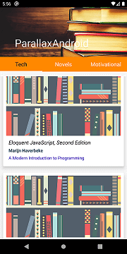
}These are the main layouts and Kotlin files required for adding a parallax effect to your app. You can get the complete project for your reference in Github here . The final output of this app will look like this.

You can customize the scroll speed and other attributes by setting them in
ImageView
of the toolbar layout. The conclusion is, the Android support library has many such utilities that help us make our app better in all the ways. We need to explore them and utilize them in making better usable apps.
Keep Learning, Keep Exploring, Keep Growing
Thank you.