
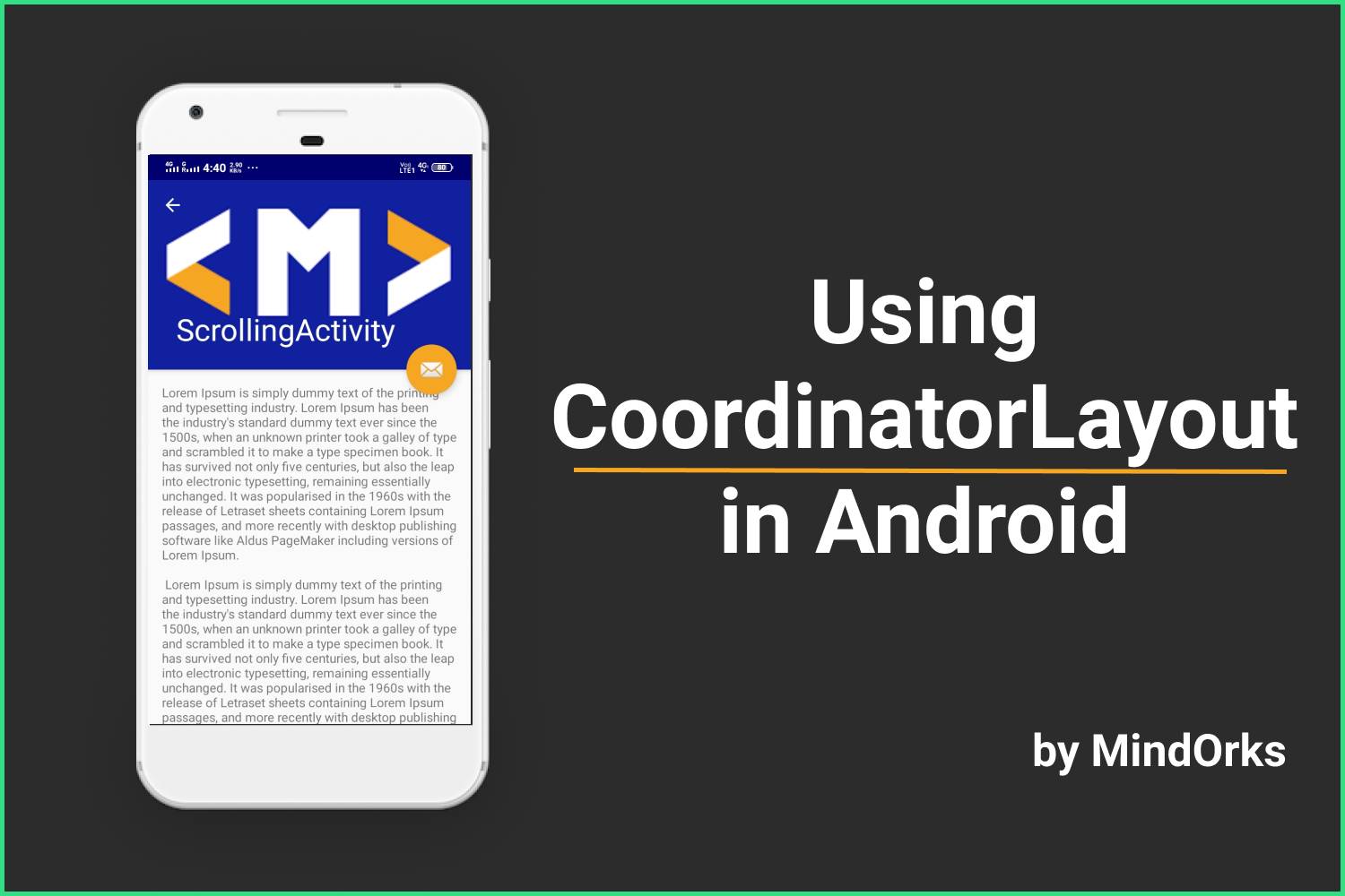
Using Coordinator Layout in Android
You all must have used FrameLayout in your Android applications and must be familiar with the difficulties that we face while managing the views in a FrameLayout especially when having some view over the other and things become worse when there is some animation present in the views. Also, it is advised not to use more than one element in our FrameLayout. The reason behind this is, you have to explicitly handle the motions or you may say the animations of all the views that are present on a particular page of your mobile application.
So, in order to handle the views(especially the view that is having some motion) in a better way, Android introduced a new layout called the CoordinatorLayout . By using Coordinator layout you can easily handle and animate the transitions of views present in a Coordinator Layout.
To have a clear understanding of the usage of Coordinator Layout, please open your WhatsApp application. Now, open any chat and click on the name of the chat. You would see the profile pic and other details of that contact. Now try to scroll down the page. Did you see any change in the profile pic? Yeah, it disappeared and now only the contact name is visible. Now, scroll up and the profile pic will be visible again. This is done with the help of CoordinatorLayout . Another example of Coordinator Layout can be seen below:

Here, we can see that one view is going over the other and the transaction or animation between these views is very smooth. That’s the power of CoordinatorLayout .
So, welcome to MindOrks! In this blog, we are going to learn about CoordinatorLayout in Android. We will see various use-cases of the Coordinator Layout with the help of an Android Studio project.
The following is the timeline of the blog:
- What is the Coordinator Layout?
- Behaviors in Android application
- Project Setup
- Implementing Scroll-Based Behavior
- Implementing Layout-Based Behavior
If you want to see the project, then you can find the project here.
What is Coordinator Layout?
According to the official documentation of Android:
CoordinatorLayout is a super-powered FrameLayout.
At the Google I/O 2015, Google introduced Coordinator Layout to remove the difficulties of having more than one layouts in FrameLayout. Now, with the help of the CoordinatorLayout, the interaction between the views become very easy even in the case of animation. CoordinatorLayout controls the animation and transactions of various child elements with one another. We have seen some examples of CoordinatorLayout in the introduction section of the blog. After looking at the examples, one question that might come in your mind is that how the CoordinatorLayout knows what to do with the child present in CoordinatorLayout? Let’s try to find the answer.
Behaviors in Android Application
Whenever a view is interacting with the other then it is done with the help of Behaviors . We create a particular behavior for a particular view and these behaviors are responsible for animations between the views. Some of the common Material Design behaviors are sliding drawers , swipe-dismissal , floating action button , a sticky button that stick on some other view. So, broadly these behaviors can be classified into two types:
- Layout-Based: Layout-Based behaviors are used to shift one view to some other place when you perform a certain operation. For example, whenever you click on a Floating Action Button(FAB), then that FAB will be moved up and one Snackbar will come from the bottom of the screen. After a few seconds, the Snackbar will be gone and the FAB will come to its original place.
- Scroll-Based: Scroll-Based behaviors are the most common use of Coordinator Layout. Here, these behaviours are based on the scroll gesture of the user on the mobile screen. Remember the example of WhatsApp, that we discussed in the introduction section. When you scroll the profile or contact page in WhatsApp, then you will find that the profile image will be changed to ActionBar. So, these types of behaviors are called Scroll-Based behaviors.
Project Setup
- Open Android Studio and create a project
- Activity: EmptyActivity
- Project Name: CoordinatorLayout-Example
- Language: Kotlin
In order to use the CoordinatorLayout in your project, you need to add the CoordinatorLayout dependency in your project. Also, we will be using some material design components. So, add the below dependency in the app level
build.gradle
file:
dependencies {
    'androidx.coordinatorlayout:coordinatorlayout:1.1.0'
    implementation 'com.google.android.material:material:1.2.0'

}
So, in this example, we will see both behaviors i.e. the layout-based and the scroll-based. So, in the MainActivtiy, we will have two buttons, one for each behavior and then two different activities for these two. So, here is the code of the
activity_main.xml
file:
<?xml version="1.0" encoding="utf-8"?>
<androidx.constraintlayout.widget.ConstraintLayout xmlns:android="http://schemas.android.com/apk/res/android"
    xmlns:app="http://schemas.android.com/apk/res-auto"
    xmlns:tools="http://schemas.android.com/tools"
    android:layout_width="match_parent"
    android:layout_height="match_parent"
    tools:context=".MainActivity">

    <androidx.appcompat.widget.AppCompatButton
        android:id="@+id/btnLayoutBased"
        android:layout_width="wrap_content"
        android:layout_height="wrap_content"
        android:text="@string/layout_based"
        app:layout_constraintBottom_toBottomOf="parent"
        app:layout_constraintEnd_toEndOf="parent"
        app:layout_constraintStart_toStartOf="parent"
        app:layout_constraintTop_toTopOf="parent" />

    <androidx.appcompat.widget.AppCompatButton
        android:id="@+id/btnScrollBased"
        android:layout_width="0dp"
        android:layout_height="wrap_content"
        android:text="@string/scroll_based"
        app:layout_constraintEnd_toEndOf="@+id/btnLayoutBased"
        app:layout_constraintStart_toStartOf="@+id/btnLayoutBased"
        app:layout_constraintTop_toBottomOf="@+id/btnLayoutBased" />

</androidx.constraintlayout.widget.ConstraintLayout>
And the code for opening the two activities on button click will be in the
MainActivity.kt
file. Here is the code for the same:
class MainActivity : AppCompatActivity() {

    override fun onCreate(savedInstanceState: Bundle?) {
        super.onCreate(savedInstanceState)
        setContentView(R.layout.activity_main)

        btnLayoutBased.setOnClickListener {
            startActivity(Intent(this, LayoutBasedActivtiy::class.java))
        }

        btnScrollBased.setOnClickListener {
            startActivity(Intent(this, ScrollBasedActivtiy::class.java))
        }
    }

}
Now, we need to create two activities i.e. one for layout-based and other for scroll-based. So, create two EmptyActivity named:
- LayoutBasedActivty
- ScrollBasedActivity
Now, let's see one by one.
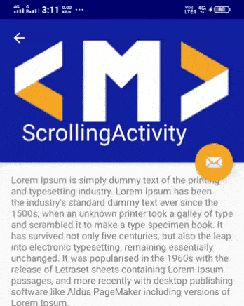
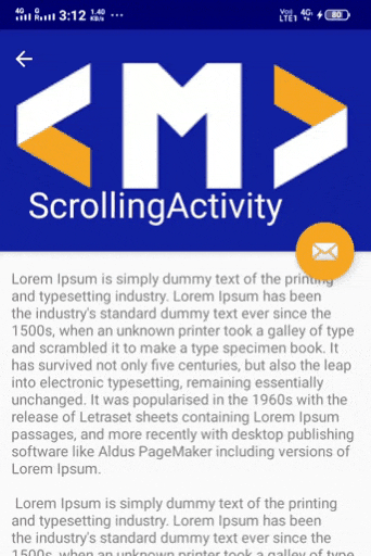
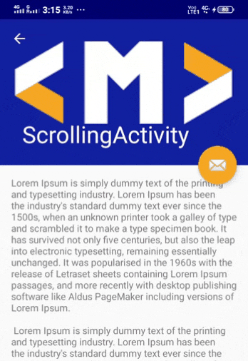
Implementing Scroll-Based Behavior
Scroll-Based behaviors are mostly used behaviors. Here we scroll one view to overlap on to the other view.
So, here in this example, we will implement the same behavior as used in the WhatsApp application.
We have already created the ScrollBasedActivity, so let's use the same.
The layout of this file contains:
- A CoordinatorLayout as the base layout
- An AppBarLayout and a FAB as a child of the CoordinatorLayout
- And finally, a CollapsingToolbarLayout as a child of AppBarLayout
Here is the code of
activity_scroll_based.xml
:
<?xml version="1.0" encoding="utf-8"?>
<androidx.coordinatorlayout.widget.CoordinatorLayout xmlns:android="http://schemas.android.com/apk/res/android"
    xmlns:app="http://schemas.android.com/apk/res-auto"
    xmlns:tools="http://schemas.android.com/tools"
    android:layout_width="match_parent"
    android:layout_height="match_parent"
    android:fitsSystemWindows="true"
    tools:context=".ScrollBasedActivity">

    <com.google.android.material.appbar.AppBarLayout
        android:id="@+id/app_bar"
        android:layout_width="match_parent"
        android:layout_height="@dimen/app_bar_height"
        android:fitsSystemWindows="true"
        android:theme="@style/AppTheme.AppBarOverlay">

        <com.google.android.material.appbar.CollapsingToolbarLayout
            android:id="@+id/toolbar_layout"
            android:layout_width="match_parent"
            android:layout_height="match_parent"
            android:fitsSystemWindows="true"
            app:contentScrim="?attr/colorPrimary"
            app:layout_scrollFlags="scroll|exitUntilCollapsed"
            app:toolbarId="@+id/toolbar">

            <androidx.appcompat.widget.AppCompatImageView
                android:layout_width="match_parent"
                android:layout_height="match_parent"
                android:fitsSystemWindows="true"
                android:scaleType="centerCrop"
                android:src="@drawable/mindorks_logo"
                app:layout_collapseMode="parallax" />

            <androidx.appcompat.widget.Toolbar
                android:id="@+id/toolbar"
                android:layout_width="match_parent"
                android:layout_height="?attr/actionBarSize"
                app:layout_collapseMode="pin"
                app:popupTheme="@style/AppTheme.PopupOverlay" />

        </com.google.android.material.appbar.CollapsingToolbarLayout>

    </com.google.android.material.appbar.AppBarLayout>

    <include layout="@layout/content_scrolling" />

    <com.google.android.material.floatingactionbutton.FloatingActionButton
        android:id="@+id/fab"
        android:layout_width="wrap_content"
        android:layout_height="wrap_content"
        android:layout_margin="@dimen/fab_margin"
        app:layout_anchor="@id/app_bar"
        app:layout_anchorGravity="bottom|end"
        app:srcCompat="@android:drawable/ic_dialog_email" />

</androidx.coordinatorlayout.widget.CoordinatorLayout>
While using the CollapsingToolbarLayout, you need to know two important things i.e.
- layout_scrollFlags
- layout_collapseMode
layout_ScrollFlags
These flags are used to specify the type of collapsing to be done. These can be used singly and with each other also.,
- scroll: When you scroll up then the collapsed view will be visible when you reach to the top. When you scroll down, the view will be scrolled just like any other ScrollView.
- enterAlways: When you scroll up then the view becomes visible irrespective of your current position. When you scroll down, the view will be scrolled just like any other ScrollView.
- enterAlwaysCollapsed: When you scroll up then the collapsed view will be visible(for example, the toolbar will be visible here) and expands(the ImageView or any other view used) when you reach to the top of the page. When you scroll down then the view(both toolbar and ImageView) will be collapsed.
- exitUntilCollapsed: When you scroll up then the view(the toolbar) will be visible and to see the expanded version of the view(having ImageView and other views) you need to scroll to the top of the page. When you scroll down, normal scrolling will be seen just like any other ScrollView.

- snap: It scrolls based on the visibility of the view. If the visibility is more than 50% then the view will show itself and if it is less then it will hide.
layout_collapseMode
This indicates the type of effect while collapsing the view.
- parallax: This is generally used with images to provide a parallax effect. The image will become in
- pin: The view will be pinned to its position. It is generally used with toolbars when you need to keep the toolbar even after collapsing the other views.
The code for the ScrollBasedActivity.kt will be:
class ScrollBasedActivity : AppCompatActivity() {

    override fun onCreate(savedInstanceState: Bundle?) {
        super.onCreate(savedInstanceState)
        setContentView(R.layout.activity_scroll_based)
        setSupportActionBar(toolbar)
        supportActionBar?.setDisplayHomeAsUpEnabled(true)
        supportActionBar?.setDisplayShowHomeEnabled(true)
        toolbar_layout.title = title
        // You can add the code for your FAB also.
    }

}
Run the application and try to scroll up and down. Also, you can use various flags and run the app to see the changed behavior.
Implementing Layout-Based Behavior
Here in this activity, we will create a Floating Action Button and on clicking the FAB, a Snackbar will come from the bottom of the screen and it will be disappeared after a few seconds.So, here is what we will have in our Activity:
- A CoordinatorLayout as our base layout
- Inside the base layout, we will have an AppBarLayout, a floating action button, and some content for the page.
Here is the code for the same:
<?xml version="1.0" encoding="utf-8"?>
<androidx.coordinatorlayout.widget.CoordinatorLayout xmlns:android="http://schemas.android.com/apk/res/android"
    xmlns:app="http://schemas.android.com/apk/res-auto"
    xmlns:tools="http://schemas.android.com/tools"
    android:layout_width="match_parent"
    android:layout_height="match_parent"
    tools:context=".LayoutBasedActivtiy">

    <com.google.android.material.appbar.AppBarLayout
        android:layout_width="match_parent"
        android:layout_height="wrap_content"
        android:theme="@style/AppTheme.AppBarOverlay">

        <androidx.appcompat.widget.Toolbar
            android:id="@+id/toolbar"
            android:layout_width="match_parent"
            android:layout_height="?attr/actionBarSize"
            android:background="?attr/colorPrimary"
            app:popupTheme="@style/AppTheme.PopupOverlay" />

    </com.google.android.material.appbar.AppBarLayout>

    <include layout="@layout/content_layout_based_activity" />

    <com.google.android.material.floatingactionbutton.FloatingActionButton
        android:id="@+id/fab"
        android:layout_width="wrap_content"
        android:layout_height="wrap_content"
        android:layout_gravity="bottom|end"
        android:layout_margin="@dimen/fab_margin"
        app:srcCompat="@android:drawable/ic_dialog_email" />

</androidx.coordinatorlayout.widget.CoordinatorLayout>
Now, create a layout file named content_layout_based_activity in the res > layout directory. This file contains the main content of the LayoutBasedActivity. For simplicity, I will use text but you can replace it according to your use-case.
Here is the code for the
content_layout_based_activity
:
<?xml version="1.0" encoding="utf-8"?>
<androidx.constraintlayout.widget.ConstraintLayout xmlns:android="http://schemas.android.com/apk/res/android"
    xmlns:app="http://schemas.android.com/apk/res-auto"
    android:layout_width="match_parent"
    android:layout_height="match_parent"
    app:layout_behavior="@string/appbar_scrolling_view_behavior">

    <androidx.core.widget.NestedScrollView
        android:layout_width="match_parent"
        android:layout_height="match_parent">

        <androidx.appcompat.widget.AppCompatTextView
            android:layout_width="wrap_content"
            android:layout_height="wrap_content"
            android:layout_margin="@dimen/text_margin"
            android:text="@string/large_text"
            app:layout_constraintEnd_toEndOf="parent"
            app:layout_constraintStart_toStartOf="parent"
            app:layout_constraintTop_toTopOf="parent" />

    </androidx.core.widget.NestedScrollView>

</androidx.constraintlayout.widget.ConstraintLayout>
And finally, you need to handle the click of the floating action button in the LayoutBasedActivity.kt file:
class LayoutBasedActivity : AppCompatActivity() {

    override fun onCreate(savedInstanceState: Bundle?) {
        super.onCreate(savedInstanceState)
        setContentView(R.layout.activity_layout_based)
        setSupportActionBar(findViewById(R.id.toolbar))

        fab.setOnClickListener { view ->
            Snackbar.make(view, getString(R.string.msg_clicked), Snackbar.LENGTH_LONG)
                .setAction("Action", null).show()
        }
    }

}
All done, now you can run the app and click on the FAB to see the layout behavior in your application.
If you want to see the project, then you can find the project here.
Conclusion
In this blog, we learned how to use Coordinator Layout in our application. Coordinator Layout is used to manage the transactions and animation of various views present in an Activity. Before Coordinator Layout, Frame Layout was used, but using more than one views in Frame Layout results in overlapping of views over one another. At the end of the blog, we did some examples to have a clear understanding. Hope you enjoyed the blog.
Keep Learning :)
Team MindOrks!