
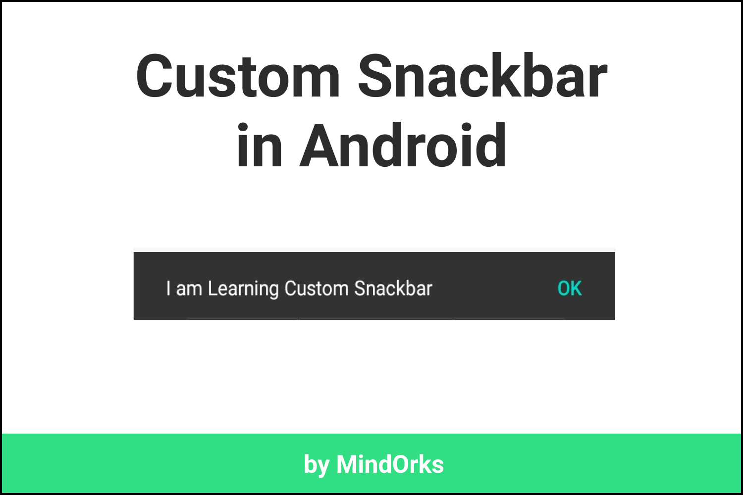
Custom Snackbar in Android
Snackbars are quite common in Android applications. Almost every application uses Snackbars for displaying some information about what's going on in the app. You can treat a Snackbar as an alternative or simply a better version of Toasts in Android.
By default, a Snackbar is shown at the bottom of the screen and it appears on top of all the elements that are present on the screen. It is associated with some view and the Snackbar will be shown only when the view is there on the screen.
So, overall we can say that Snackbars are awesome. But to increase this awesomeness to the next level we can customize the Snackbar according to our need. In this blog, we will learn how to make a custom Snackbar in Android. So, let's get started with normal Snackbar.
Using Normal Snackbar
To use a Snackbar in your app, all you need to do is have the Material Design dependency in your app. So, add the below dependency in you
build.gradle
file:
implementation "com.google.android.material:$latest_version"And then you can use the Snackbar just like a Toast. For example:
Snackbar.make(view, "Show some message here", Snackbar.LENGTH_SHORT).show()The above code will show a simple message in the Snackbar. There are some functions that are available with Snackbar. For example:
- setAction(): This can be used to have some action on the Snackbar. For example, you can use a Snackbar to display a network error message and have an action called Retry.
- setBackgroundColor(): This can be used to change the background color of the Snackbar.
-
setAnchorView():
By default, the Snackbar appears at the bottom of the screen. But you can change its position with the help of
setAnchorViewfunction.
There are other functions as well that can be used with Snackbar. You can find those methods form the Material Design Website .
Custom Snackbar
Now, its time to create our own Snackbar.
So, the very first thing that we are going to do is create a custom layout for the Snackbar. So, for that, we need to create some files. Create two classes named
CustomSnackbar
and
CustomSnackbarView
. After that, create two XML files named
item_custom_snackbar
and
layout_custom_snackbar
.
The
item_custom_snackbar
will contain the elements of the Snackbar. Here, we will have one text view and one image view in the Snackbar. You can change the UI as per your need. So, the code for the
item_custom_snackbar
will be:
<?xml version="1.0" encoding="utf-8"?>
<androidx.constraintlayout.widget.ConstraintLayout xmlns:android="http://schemas.android.com/apk/res/android"
    xmlns:app="http://schemas.android.com/apk/res-auto"
    android:layout_width="match_parent"
    android:layout_height="60dp">

    <ImageView
        android:id="@+id/ivCheck"
        android:layout_width="60dp"
        android:layout_height="match_parent"
        android:src="@drawable/ic_check_circle"
        app:layout_constraintBottom_toBottomOf="parent"
        app:layout_constraintEnd_toEndOf="parent"
        app:layout_constraintTop_toTopOf="parent" />

    <TextView
        android:id="@+id/tvMessage"
        android:layout_width="0dp"
        android:layout_height="match_parent"
        android:gravity="center_vertical"
        android:padding="8dp"
        android:text="Payment Successful!"
        android:textSize="30sp"
        app:layout_constraintBottom_toBottomOf="parent"
        app:layout_constraintEnd_toStartOf="@+id/ivCheck"
        app:layout_constraintStart_toStartOf="parent" />

</androidx.constraintlayout.widget.ConstraintLayout>
Now, to create the custom Snackbar view, you need to implement the
ContentViewCallback
. This is used to tell when the content of the Snackbar starts appearing and when it is disappearing from the screen. So, the code of the
CustomSnackbarView
will be:
class CustomSnackbarView @JvmOverloads constructor(
    context: Context,
    attributeSet: AttributeSet? = null,
    defaultStyle: Int = 0
) : ConstraintLayout(context, attributeSet, defaultStyle), ContentViewCallback {

    init {
        View.inflate(context, R.layout.item_custom_snackbar, this)
    }

    override fun animateContentIn(delay: Int, duration: Int) {
        // TODO("Use some animation")
    }

    override fun animateContentOut(delay: Int, duration: Int) {
        // TODO("Use some animation")
    }

}
Here, we are having two functions called
animateContentIn
and
animateContentOut
, these are used to have some animation when the content of the Snackbar is appearing and disappearing from the screen.
Now, our custom view is ready and we can use this view in any layout file. So, we are going to use this in our
layout_custom_snackbar
. The code for the same will be:
<?xml version="1.0" encoding="utf-8"?>
<com.example.snackbarexample.CustomSnackbarView xmlns:android="http://schemas.android.com/apk/res/android"
    android:layout_width="match_parent"
    android:layout_height="match_parent" />
And finally, the code for the
CustomSnackbar
will be:
class CustomSnackbar(
    parent: ViewGroup,
    content: CustomSnackbarView
) : BaseTransientBottomBar<CustomSnackbar>(parent, content, content) {

    init {
        getView().setBackgroundColor(
            ContextCompat.getColor(
                view.context,
                android.R.color.transparent
            )
        )
        getView().setPadding(0, 0, 0, 0)
    }

    companion object {

        fun make(viewGroup: ViewGroup): CustomSnackbar {
            val customView = LayoutInflater.from(viewGroup.context).inflate(
                R.layout.layout_custom_snackbar,
                viewGroup,
                false
            ) as CustomSnackbarView

            customView.tvMessage.text = "Some Custom Message"

            return CustomSnackbar(viewGroup, customView)
        }

    }

}
Here, you can customize the content of the Snackbar in the code itself i.e. you can change the text message or you can change the image also. By default, the background of the Snackbar will be grey. So, in the
init
block, we have made it transparent.
Now, you can use this class by calling the
make
method(by passing the parent view group) just like the normal Snackbar. For example, you can call this class by:
CustomSnackbar.make(window.decorView.rootView as ViewGroup).show()This is as simple as calling a normal Snackbar. Here is what you get when you use the above code:
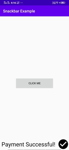
So, in this way you can make a custom Snackbar of your own.
Hope you learned something new today.
Happy Learning!