
Android User Interface — XML and View Components
The Android application having an excellent UI will have a large number of users because usually, people get attracted towards the look and feel of the application. So, to make the UI of the application good, we need to learn about XML(Extensible Markup Language) and View components in Android. So, in this blog, we will learn about User Interface(UI) in Android. Here, we are going to start with XML (extensible markup language) and design a screen and understand what the different types of View Components Android Studio provided to us. So, let's start with View.
View
The view is the component which Android provides us to design the layouts of the app. So, we can understand view as a rectangular area which is going to contain some element inside it.
A View is a superclass for all the UI components. You can also check out the official documentation of View, here .
What are these UI components that we can use in our application? Let's make a small list of some of the view components:
- TextView: To add some text in your application.
- EditText: This is used when you want to take some input from the users.
- ImageView: To add some image in the application.
- ProgressBar: To show the progress to something. For example, the loading screen.
- Button: Buttons are used to trigger some action on the click of the button. It can be starting a new activity or something else.
- ImageButton: It is used to make a clickable image.
- CheckBox: CheckBox is used to select some options out of many available options.
- DatePicker: To select some particular date.
These are some of the UI components that are available for our use.
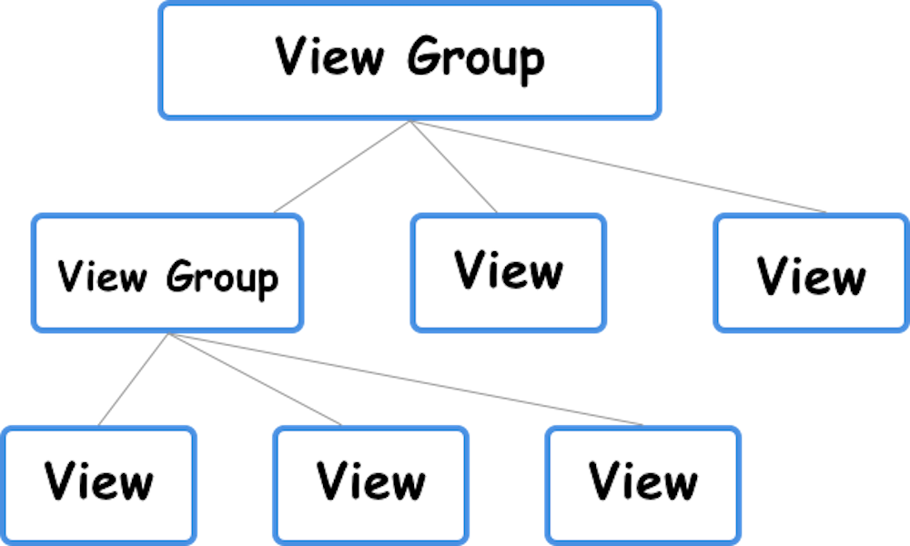
A group of view is known as ViewGroup . The Top-level ViewGroup is a parent, and under it, all the view and other view groups are its children. For example , under a LinearLayout, you can add two Buttons and one EditText. Here, LinearLayout is the parent view and the Buttons and EditTexts are the children.
Create User Interface
You can edit the layout file that is available to you like activity_main.xml or you can create one layout file by going app > res > layout > right-click > New > Layout resource file and then enter the file name and click on OK .
You can find your existing XML files in app > res > layout > your_xml_files .
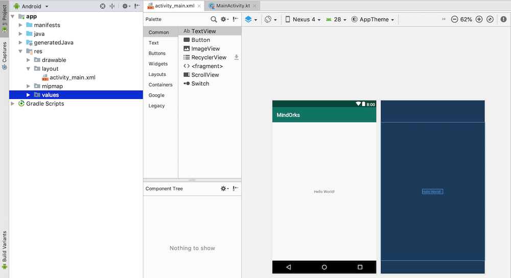
You can see a palette of components which divided into different sections like widget, text, layouts etc. Either you can add the elements by dragging and dropping the elements or you can write the code for those elements. There are two options that are available when you open an XML file i.e. Design and Text . In the Design part, you can drag and drop the elements you want to use, while in the Text part, you can write the code for those elements.
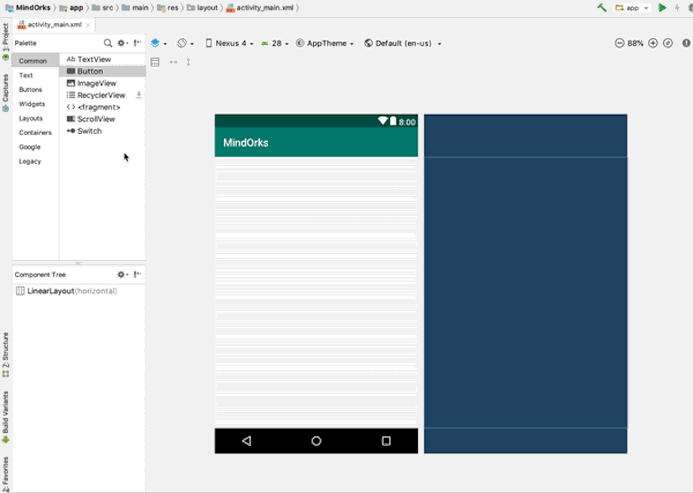
Here is an example of drag and drop:
You can customise elements property like colour, size, text etc.
Let's discuss some of the view customisations:
Width and Height of a View
- wrap_content: This will wrap the content of a view. For example , if you are using LinearLayout and the LinearLayout consists of two buttons and you are using the height of the LinearLayout as wrap_content, then the height of the LinearLayout will be equal to the length under which both the buttons are present i.e. the LinearLayout is wrapping the contents present in it.
- match_parent : If a view is using match_parent, then it will get the same size as its parent is having. For example , if LinearLayout is the parent view and the height of LinearLayout is 80dp, then if we are using Button inside the LinearLayout with height as match_parent, then the height of the Button will also be 80dp i.e. matching the parent.
Resources
Resources is something that you will use in your application. For example , it can be the images or the layout files or some string values or something else. Following are the folders that are present inside the res folder:
- Drawable: here, we put all our graphics, vector images, custom drawings.
- Layout - here, we put all our screen layout files. example: activity_main.xml
- Mipmap - here, we put the images which are used to make the logo of the application.
- Values - this folder contains four default files. colors.xml, dimens.xml, strings.xml, style.xml.
To arrange the code in a better way, Android Studio provides us with this feasibility where we can define all our colours, strings, sizes and styles at one place and use them wherever we need it. For example :
// colors.xml - you can define all your colors here
<color name="colorPrimary">#EFC455</color>
// dimens.xml - you can define all the size here
<dimen name="height">150dp</dimen>// strings.xml - you can define all the strings here
<string name="app_name">MindOrks</string>// styles.xml - you can define all the styles here
<style name="AppTheme" parent="Theme.MaterialComponents.Light.NoActionBar">
<item name="colorPrimary">@color/colorPrimary</item>
</style>Size
Every measurement has a particular unit like Km for distance, L for liquids, etc. Similarly, Android also has its own measurement system.
- For text size, we use " sp " ( Scale Independent Pixels).
- For views other than text, we use " dp " ( Density Independent Pixel).
Now, suppose you are using some 20px * 20px image in your application. That image might look good in small mobile devices but for large-screen mobile devices that image might not look good due to low resolution. So, you have to use different resolutions of images for different mobile screen. So to store these images separately, Android Studio has separate folders. All you need to do is put the images in these folders with the same name and Android will do the rest for you. The following folders are present in Android Studio:
- ldpi: resources of low-density (~ 120dpi)
- mdpi: resource of medium-density (~ 160dpi)
- hdpi: resources of high-density (~ 240dpi)
- xhdpi: resources of extra-high-density (~ 320dpi)
- xxhdpi: resources of extra-extra-high-density (~ 480dpi)
- xxxhdpi: resources of extra-extra-extra-high-density (~ 640dpi)
We only need to put things in those folders and Android System automatically take stuff from here based on the resolution of the mobile screen on which the application is running.
You can find these folders under the res folder(open the project in Project or Package or Project Files view).
Example
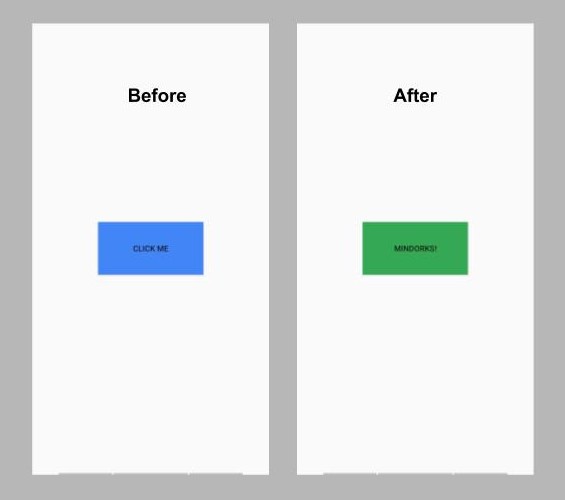
Here, in this example, we will create a one activity application and we will add one Button with some text on it. When you click on the button, then the text and the colour of the button will be changed. For better understanding, we will store all the texts in strings.xml file and all the colours in colors.xml file.
Create a project in Android Studio. After creating the project, go to res > values > strings.xml and add the below lines:
<string name="text_before">Click Me</string>
<string name="text_after">MindOrks!</string>
Now go to res > values > colors.xml and add the below two colours:
<color name="backgroundButtonBefore">#4285F4</color>
<color name="backgroundButtonAfter">#34A853</color>
Now, in the activity_main.xml file, add the below code:
<?xml version="1.0" encoding="utf-8"?>
<androidx.constraintlayout.widget.ConstraintLayout xmlns:android="http://schemas.android.com/apk/res/android"
    xmlns:app="http://schemas.android.com/apk/res-auto"
    xmlns:tools="http://schemas.android.com/tools"
    android:layout_width="match_parent"
    android:layout_height="match_parent"
    tools:context=".MainActivity">

    <Button
        android:id="@+id/button"
        android:layout_width="160dp"
        android:layout_height="80dp"
        android:background="@color/backgroundButtonBefore"
        android:text="@string/text_before"
        app:layout_constraintBottom_toBottomOf="parent"
        app:layout_constraintEnd_toEndOf="parent"
        app:layout_constraintStart_toStartOf="parent"
        app:layout_constraintTop_toTopOf="parent" />
</androidx.constraintlayout.widget.ConstraintLayout>
Now, we are done with the layout file. Here, you can notice how we have used the text and colours that are stored in their respective files.
Now, open the MainActivity.kt file and add the below code:
class MainActivity : AppCompatActivity() {

    // variable for button
    private lateinit var button: Button

    override fun onCreate(savedInstanceState: Bundle?) {
        super.onCreate(savedInstanceState)
        setContentView(R.layout.activity_main)

        // connecting the variable with its id
        button = findViewById(R.id.button)

        // using setOnClickListener()
        button.setOnClickListener {
            // changing the backgroundColor
            button.setBackgroundColor(ContextCompat.getColor(this, R.color.backgroundButtonAfter))
            // changing the text of the button
            button.setText(R.string.text_after)
        }
    }
}
Now, run the application in our mobile device or on the Android Emulator and you will see something like below:
Try to experiment with this application by using various other views in your application like TextView, EditText, etc. These views will only be clear to you if you use them in your application.
That's it for this blog. Hope you learned something new today.
Happy Learning :)
Team MindOrks!