
Building UI using Jetpack Compose in Android

In the android world, we use LinearLayout, Relative layout and what not to design the UI. Then we started using ConstraintLayouts to design UIs. But we still missed the trick to designing declarative UI in Android. We had a lot of different libraries to do it, but none of them had a native Android Support.
In Google IO '19, Google launched Jetpack Compose to create declarative UI. So, basically, declarative UI means to create UI by specifying a specific set of UI elements we need and to structure it some way.
Project to learn Jetpack Compose for Android by Examples.
Why we should use Jetpack Compose?
We should use Jetpack compose because using it we have to write less code compared to what we write today. For example, we are not writing XML files explicitly now. Also, using compose we can write any type of UI just by using Kotlin.
So, let's discuss one by one about how we can use the jetpack compose.
If you want to learn Jetpack Compose by video, click here
PS : You should be on 4.2 Canary build of Android Studio
Step 01. Setup
First, add google() to the project's build.gradle file
allprojects {
    repositories {
        google()
        jcenter()
    }
}
Step 02. App's Gradle
android {
    defaultConfig {
        ...
        minSdkVersion 21
    }

    buildFeatures {
        // Enables Jetpack Compose for this module
        compose true
    }
    ...

    // Set both the Java and Kotlin compilers to target Java 8.

    compileOptions {
        sourceCompatibility JavaVersion.VERSION_1_8
        targetCompatibility JavaVersion.VERSION_1_8
    }

    kotlinOptions {
        jvmTarget = "1.8"
    }
composeOptions {
kotlinCompilerVersion "1.3.61-dev-withExperimentalGoogleExtensions-20200129"
kotlinCompilerExtensionVersion "0.1.0-dev06"
}Step 03. Project's gradle file
dependencies {
    classpath 'com.android.tools.build:gradle:4.0.0-alpha01'
    classpath "org.jetbrains.kotlin:kotlin-gradle-plugin:1.3.60-eap-25"}
Step 04. Finally, Add Project dependency
implementation 'androidx.ui:ui-framework:0.1.0-dev06'
implementation 'androidx.ui:ui-layout:0.1.0-dev06'
implementation 'androidx.ui:ui-material:0.1.0-dev06'
implementation 'androidx.ui:ui-tooling:0.1.0-dev06'
Now, we are done setting up the project. Let's build the UI. Till now, we use setContentView to inflate the layout from an XML file. But in this tutorial, we are going to use Jetpack compose to design the layout file.
Step 05. In your Activity File,
override fun onCreate(savedInstanceState: Bundle?) {
    super.onCreate(savedInstanceState)
    setContent {
        //your design
    }
}
Now, we set the design in setContent. Here we call a function. We use composable functions. So, as a developer let's start with Hello World.
class MainActivity : AppCompatActivity() {
    override fun onCreate(savedInstanceState: Bundle?) {
        super.onCreate(savedInstanceState)
        setContent {
            Text("Hello world!")
        }
    }
}
Step 06. Let's discuss how to create a composable function.
to create a composable function we need to use @Composable annotation.
@Composable
fun helloWorld() {
    Text(text = "Hello World")
}
and call helloWorld () in setContent{}
- Composable functions can be only called from another Composable function.
- Composable functions are the functions that we use to draw the UI on the screen. All the widgets written inside it is rendered on the screen.
Step 07. Let's define a container.
Here if we need to have a behavior in LinearLayout with orientation in vertical mode. Here, we use Column,
Column {
    //the inside widgets
}
This will stack the elements in Linear layout in vertical order. In this let's discuss with an example of buttons,
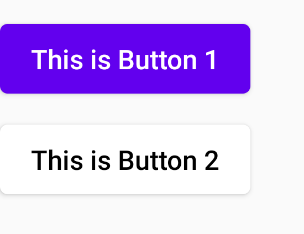
Column {
    Button {
        Clickable(onClick = {
            Log.d(TAG, "This is Button 1")
        }) {
            Text("Click Me", style = TextStyle(color = Color.White))
        }
    }
    Spacer(modifier = LayoutHeight(16.dp))
    Button(backgroundColor = Color.White) {

        Clickable(onClick = {
            startActivity(
                Intent(
                    this@MainActivity,
                    UserListActivity::class.java
                )
            )
        }) {

            Text(text = "This is Button 2", style = TextStyle(color = Color.Black))
        }
    }
}
Here, we have designed two buttons
-
Where we first declared a
Buttonwidget, and inside it, we implemented aClickablewhich is responsible for the click of a button. In this first button, It will print a Log. In this, we updated the style of text in the button usingTextStyle(). -
Then we added a
Spacer, in which it adds a space between two buttons of 16dp unit. -
And at last, the second button, we implemented which will open a new activity on its click. Here, we changed the text style and also changed the
backgroundColorofButtonto white.
Output
If we want to take the design of the Material design principle in android, we can use
MaterialTheme
()
MaterialTheme {
    // Widgets 1
    // Widgets 2
    // Widgets 3
}
Step 08. Let's discuss how to build a list using Jetpack Compose,
Let us first create a new activity called UserListActivity and in that add,
class UserListActivity : AppCompatActivity() {
    override fun onCreate(savedInstanceState: Bundle?) {
        super.onCreate(savedInstanceState)
        setContent {
            MaterialTheme {
                populateUser()
            }
        }
    }}
In this, we have added a widget Material Theme and then added a child composable function
populateUser
() to it.
Now,
populateUser
() will look like,
@Preview
@Composable
private fun populateUser() {
    setupList(UserDataSource.getUsers())
}
Here, we will have another composable function,
setupList
() and in that we will pass the list of User from the data source. It can be either from local storage, static data or even from API.
Our User data class looks like,
data class User(val id: Int = 0, val name: String = "", val email: String = "")Now, in our example, we will create a list displaying the User's name and email.
In
setupList
() function,
@Composable
private fun setupList(users: List<User>) {
    VerticalScroller {
        Column {
            users.let {
                it?.forEach { user ->
                    printUser(user)
                }
            }
        }
    }
}
we will add a widget called
VerticalScroller
which will be responsible for displaying the list of the user. In the widget, we add a
Column
so that, we can have all the users stacked vertically. Then we iterate through to get the user individually and pass it to
printUser()
composable function.
In the
printUser()
function,
@Composable
private fun printUser(user: User) {
    Ripple(bounded = true) {
        Clickable(
            onClick = {
                Toast.makeText(
                    this@UserListActivity,
                    "You click on name ${user.name}",
                    Toast.LENGTH_SHORT
                ).show()
            }
        ) {
            Card {
                    Container(
                        padding = EdgeInsets(16.dp),
                        modifier = LayoutWidth.Fill,
                        alignment = Alignment.CenterStart
                    ) {
                        Column {
                            Text(text = user.name, style = MaterialTheme.typography().h6)
                            Text(text = user.email, style = MaterialTheme.typography().body1)
                        }
                    }


            }
        }
    }
}
We first create a
Column
widget to wrap two Text inside it which will have the name and email. In this, the name has a style of
Heading6
and email has of
body1
. This is very similar to how we pass styling in HTML.
Now, we will wrap is using the
Container
widget to add some padding from all sides of
16dp
and will add a modifier for Fill. Here,
EdgeInsets
means that It will add padding of 16dp from all sides and
LayoutWidth.Fill
in what
match_parent
is in XML.
alignment
in Container widget is to make sure where its children start from.
Then, we wrap it under
Card
to provide a card view type of view for each item.
Now, we add
Ripple
widget to have a ripple effect when we click it. Clickable is similar to how we did above. Here, on the click, we show a toast.
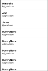
This is the output that we will get from the above code.
Managing State In Compose
When building UI, we set the data at the instance when our code gets called. But how would we manage the data in the UI when data has changed and we have to update the UI with the new data?
To manage state in Jetpack compose, we use
@Model
in front of the class. So, it helps in observing changes in data. And once the data is changed, it redraws the UI whose data has changed and not the whole UI tree.
@Model are thread-safe
Note: If we add
@Preview
on top of any composable function, we can see the function in the Android Studio itself before running it into an actual device to be sure how it looks. This is similar to how we used to see the preview of XML files which we used to design.
To learn in detail, click here
If you want to learn, how to manage state in Jetpack Compose click here.
Happy learning.
Team MindOrks :)