
Understanding Density Independence Pixel: sp, dp, dip and all in android
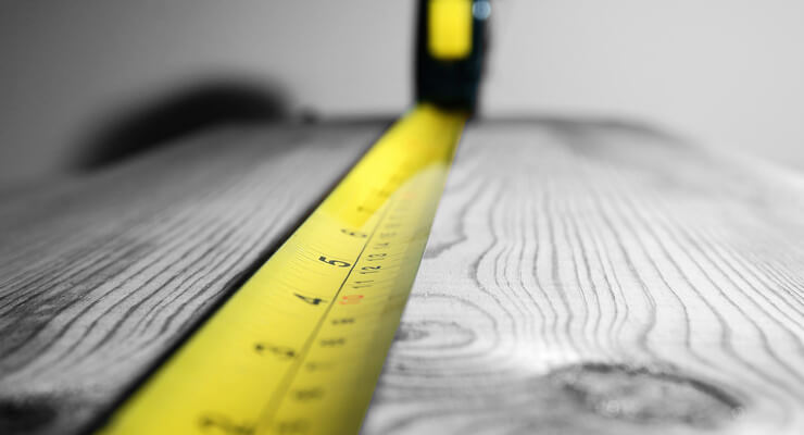
What does the French Revolution have to do with the time NASA accidentally crashed a $200 million orbiter into the surface of Mars?
Crash happened due to a small mistake on the unit conversion between two measurement systems. At the time of French Revolution, France alone has a quarter million different units. Revolutionaries found such system displeasingly irrational and in need of the new system. They switch out to the Metric System. Gradually, everyone accepts this new standard system except few countries like America where they follow the older imperial system where things measured in feet, inches and pounds.
How the French Revolution and NASA crash orbiter is connected to this article?
All the web developers discussions are in pixels whereas android developers discussions are in dp or sp(pronounce as dips). Websites displayed on the screen the same as mobile apps. Does the measurement system is the same?
First, Let’s have a look at the terminologies:
Pixels — (Google Definition) a minute area of illumination on a display screen, one of many from which an image is composed.
Screen Resolution
— Resolution is always referred in x*y form, which means x is the number of pixels in horizontal direction and y is the number of pixels in a vertical direction.
Example — HD display 1920*1080 = 2,083,600 is the total pixels on screen
Pixels per inch
— This is the measurement of the pixel density(resolution).
Example — I have an image of 100*100 pixel which I need to print on a 1-inch square. Now, it will have a resolution of 100 pixels per inch.
Through this terminologies, we can say that now we can design the UI for Android based on the pixels of the displaying screen. But, this world consists of a variety of display screen sizes which is not possible for us to design with.
Here comes the Density Independent Pixel (dip).
<Button
android:layout_width=”100dp”
android:layout_height=”50dp” />
In Android Development, we have seen many developers using dp as a measurement unit for all the views. But, what’s dp? what's sp? And how this dp/sp helps us to achieve the same size in different screen sizes?
Let’s see the relation between pixels and density-independent pixels
Taking an example of three devices of the same physical size but different resolution.
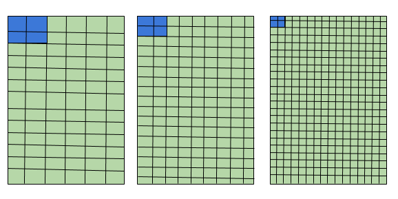
If I define my Button’s height and width in pixel, this is going to happen in different device resolution. Button covers 2 pixels horizontally and 2 pixels vertically but the pixel density(resolution) is different which makes our button size small.
So, what’s the solution here? Now, I will use dp as a measurement unit.
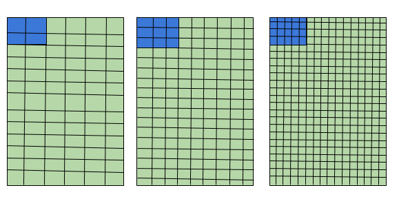
Here, we can see the size of the button is the same in all the devices. What Android has done here is, map the number of pixels.
There is one more unit called SP. What is sp? And when should we use sp? And when should we use dp?
Scale Independent Pixels
—This is same as dp, but by default, android resizes it based on the font size of the user’s phone.
sp is only used for the text, never use it for the layout sizes.
<TextView
 android:layout_width=”100dp”
 android:layout_height=”50dp”
 android:textSize="20sp" />
What’s the conversion of pixel and dip?
In Android, we have a baseline density of 160 dots-per-inch(dpi). So, for a 160 dpi screen, we have 1 pixel = 1 dp and 320 dpi screen, we have 2 pixels = 1 dp which is 2x.
px = dp * (dpi / 160)
Let’s say we have a tablet of 1280*800 pixels, 160 dpi and phone of 800*1280 pixels, 320 dpi. Their pixel resolution is the same. But, what will be in the dp?
Tablet is of 160 dpi which is baseline so, 1280*800 dp but the phone is of 320 dpi which is half, 400*640dp. This helps us to design the layout for a tablet and phone very quickly. We can also think of a screen of 1280 dp versus 400 dp.
Let’s say we have two devices of the same size but different resolution. One is 400*640 pixels, 160 dpi and another is 800*1280 pixels, 320 dpi.
Now, if we convert this in density-independent pixels, we have the same size of 400*640 dp. This makes us design a single layout for both the screens.
Now, we can understand the meaning of
Density Independent Pixels,
(Pixels not depending on the density)
Density Bucket
Many times we had seen some words like MDPI, HDPI, XHDPI, XXHDPI inside our Android Studio. What are these? These are the Density Bucket. We have different size of size to design for, but to make it simple, all the screens are grouped under density bucket.
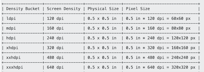
This is the screenshot of a StackOverflow answer explaining density bucket. This chart can help us to understand which resolution devices comes in which bucket either mdpi or hdpi etc.
res/layout/main_activity.xml
# For handsets (smaller than 600dp available width)
smallestWidth - sw<N>dp
The smallest width is fixed screen size; the device's smallest width doesn't change when the screen's orientation changes.
sw320dp
sw600dp
sw720dp
res/layout-sw600dp/main_activity.xml
# For 7” tablets (600dp wide and bigger)
Available width - w<N>dp
This configuration value changes when the orientation changes between landscape and portrait to match the current actual width.
w720dp
w1024dp
res/layout-w600dp/main_activity.xml
# For 7” tablets or any screen with 600dp
land - This helps us to design for landscape
res/layout-land/main_activity.xml
# For handsets in landscape
res/layout-sw600dp-land/main_activity.xml
# For 7” tablets in landscape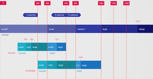
Thanks for reading! If you find this reading useful, please share to help others find it! Feel free to leave a comment ???? below. Have feedbac k?