
Jetpack Compose Tutorial - Step by Step Guide

In this tutorial, we are going to learn about the Jetpack Compose, a modern toolkit for building native UI.
We will learn how to use Text, TextField, Preview, Column, Row, Button, Card, AlertDialog, MaterialDesign elements, etc, with this complete tutorial. So, without any further delay, let's get started by creating a Jetpack Compose Project. So, this tutorial is all about Learning Jetpack Compose for Android by Example.
Project to learn Jetpack Compose in Android by example. You can follow this project along with this blog.
NOTE: To use Jetpack Compose, you need to have the latest Canary version of Android Studio 4.2. So, you can move over to the Android Studio Preview page and download the latest Canary version and then make an Empty Compose Activity.
Composable Function
In Jetpack Compose, Composable functions are used to define all the UI of your app programmatically. So, you need not use any XML files for the layout of the app. All you need to make a composable function is just by using the
@Composable
annotation to the function name. The basic syntax of a Composable function is:
@Composable
fun AnyUiComponent() {
    // Code for UI element
}
Now, you know what Composable Functions are and how to make a composable function by using the
@Composable
annotation. Let's move on to the example of Text.
Displaying a Simple Text
In this section of this tutorial, we are going to learn how to display a simple text using compose.
To display a text, we use Text Composable and inside that, we pass the string that we want to display. For example,
@Composable
fun SimpleText(displayText: String) {
    Text(text = displayText)
}
Here,
SimpleText
is a Composable function and inside that function, we are using
Text
and passing
displayText
into it.
Now, you can call this
SimpleText
function from the
setContent
block of the
onCreate
method of the activity.
class SimpleTextActivity : AppCompatActivity() {
    override fun onCreate(savedInstanceState: Bundle?) {
        super.onCreate(savedInstanceState)
        setContent {
            Column(
                modifier = Modifier.fillMaxSize(),
                verticalArrangement = Arrangement.Center,
                horizontalAlignment = Alignment.CenterHorizontally,
            ) {
                SimpleText(getString("I am learning Compose"))
            }
        }
    }
}
Here, we are using a
Column
that is used to display some content vertically and inside that Column, we are calling the
SimpleText
Composable function.
Applying Styles to a Text
We can apply various styles to a Text such as increasing the font size, changing the color, etc.
So, let's make a function named
SetTextStyling
:
@Composable
fun SetTextStyling(displayText: String, style: TextStyle? = null, maxLines: Int? = null) {
    Text(
        text = displayText,
        modifier = Modifier.padding(16.dp),
        style = style ?: TextStyle.Default,
        overflow = TextOverflow.Ellipsis,
        maxLines = maxLines ?: Int.MAX_VALUE
    )
}
In the above function, the parameters are displayText i.e. the text to be displayed, style i.e. the style to be put on the Text, and maxLines i.e. the maximum number of lines allowed for the text. If the text is more than the maximum line, then ellipsis(...) will be shown.
We will call this function by passing these parameters. Let's see some of these:
- To set font-size:
style = TextStyle(
    fontSize = 24.sp
)- To set font-weight, pass text-style as:
fontWeight = FontWeight.BoldSimilarly, you can change the font-Size, textColor, font-family, underline a text, etc. You can see all these from our Opensource Project.
Taking inputs using TextField
Just like EditText, in Compose we can use
TextField
and
BaseTextField
.
BaseTextField
is still experimental and can be removed or added permanently at any time. So, to use
BaseTextField
, you need to add
@ExperimentalFoundationApi
annotation.
The following is an example of a simple
BaseTextField
:
@ExperimentalFoundationApi
@Composable
fun SimpleTextFieldComponent() {
    Surface(color = Color.LightGray, modifier = Modifier.padding(16.dp)) {
        var text by remember { mutableStateOf(TextFieldValue("Enter text here")) }
        BaseTextField(
            value = text,
            modifier = Modifier.padding(16.dp).fillMaxWidth(),
            onValueChange = {
                text = it
            }
        )
    }
}
In the above function, we are having a
BaseTextField
inside a
Surface
. We have a callback named
onValueChange
. This callback is called when there is some change in the input to the
BaseTextField
and the updated text will come as a parameter from the callback.
This is an example of
BaseTextField
. The Material Design also provides one Composable for EditText i.e.
TextField
. A simple implementation of
TextField
is as below:
@Composable
fun SimpleMaterialTextFieldComponent() {
    var text by savedInstanceState { "" }
    TextField(
        value = text,
        modifier = Modifier.padding(16.dp).fillMaxWidth(),
        onValueChange = { text = it },
        label = { Text("Label") }
    )
}
TextField
behaves similar to that of
BaseTextField
. Here in
TextField
, you have one more thing i.e.
label
. A label is a text that is displayed inside the
TextField
when there is no text in the
TextField
.
We can customize this BaseTextField and the TextField by passing various parameters to it. For example,
- To show only numerical keyboard:
var text by remember { mutableStateOf(TextFieldValue("0123")) }
BaseTextField(value = text,
    keyboardType = KeyboardType.Number,
    onValueChange = {
        text = it
    }
)- To take a password as an input:
keyboardType = KeyboardType.Password,
visualTransformation = PasswordVisualTransformation()- To add a placeholder in TextField(will be displayed when TextField is empty and focused)
placeholder = { Text("MindOrks") }Similarly, we can add icons, show error message in TextFiled, set errorColor, backgroundColor, intractionState, activeColor, inactiveColor, etc. You can find these on our Opensource Project.
You can try these and see the output in the Android Studio itself. Yes, you heard it right. You can preview any UI element in Android Studion itself. Let's see how.
Preview in Android Studio
Android Studio provides an awesome feature of previewing your UI components in the studio itself and that too dynamically. So, whenever you want to test some UI components, then you can simply preview it in the Android Studio by making a Composable function and by using the
@Preview
annotation.
The following is an example of the same:
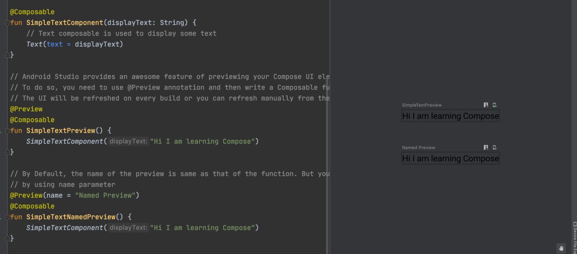
// This is a Composable function to display a Text
@Composable
fun SimpleText(displayText: String) {
    Text(text = displayText)
}

@Preview
@Composable
fun SimpleTextPreview() {
    SimpleText("Hi I am learning Compose")
}
Now, in the preview tab(right-hand side of the Studio), you can see the preview of the above Composable function.
You can use as many previews as you want with different width and height. If you click on any of the UI elements in the preview, then the Android Studio will take you to the line where that UI is created.
Also, you can put some names to a Preview by using the
name
parameter. To name a preview you need to add the below code:
@Preview(name = "Named Preview")By default, the name of the preview is the name of the function.
The following is an example of the preview feature in Android Studio:
NOTE: You can't pass any parameter to a Preview Composable function.
Preview Parameter
In the last section, we learned how to use the preview feature of Android Studio. Now, when we make any Android application, then in most of the cases the data is coming from the server and we populate those data in our app. So, the next question is how to preview that UI where the data is coming from the server i.e. whose data is not available right now. For these situations, we can use
@PreviewParameter
annotation.
The main idea is to make a dummy data and pass that dummy data to the Preview Composable Function. Since you can't pass any parameter to a Preview Composable Function, so in order to achieve this, you need to pass the parameter by using the
@PreviewParamter
annotation.
So, let's first create a dummy data class.
Make a data class named
Blog.kt
and add the below code into it:
data class Blog(
    val name: String,
    val author: String
)
Now, create a class named
DummyBlogProvider
which implements an interface named
PreviewParameterProvider
:
class DummyBlogProvider : PreviewParameterProvider<Blog> {
    override val values =
        sequenceOf(Blog("Learning Compose", "MindOrks"), Blog("Learning Android", "MindOrks"))
    override val count: Int = values.count()
}
Now, we are done with the dummy data and we can use this dummy data in our preview. The following is an example of the same:
@Preview
@Composable
fun BlogInfo(@PreviewParameter(DummyBlogProvider::class) blog: Blog) {
    SimpleTextComponent("${blog.name} by ${blog.author}")
}
You can see the preview of the UI with your dummy data.
Column
A
Column
is a layout composable that is used to place all its children vertically one after the other. It is similar to LinearLayout with vertical orientation.
The following is an example of a Column:
@Composable
fun SimpleColumnComponent() {
    Column(modifier = Modifier.padding(16.dp)) {
        Text(text = "Hello! I am Text 1", color = Color.Black)
        Text(text = "Hello! I am Text 2", color = Color.Blue)
    }
}
Scrollable Column
When you use a simple
Column
, then you are restricted to use the height of the mobile screen only. But if your content is going out of the screen then you can use
ScrollableColumn
. ScrollableColumn is just like ScrollView.
The following is an example of the same:
@Composable
fun ScrollableColumnComponent(blogList: List<Blog>) {
    ScrollableColumn {
        val context = ContextAmbient.current
        Column {
            for (blog in blogList) {
                Card(
                    shape = RoundedCornerShape(4.dp),
                    modifier = Modifier.fillMaxWidth().padding(16.dp).clickable(onClick = {
                        Toast.makeText(context, "Author: ${blog.author}", Toast.LENGTH_SHORT).show()
                    }),
                    backgroundColor = Color(0xFFFFA867.toInt())
                ) {
                    Text(
                        blog.name, style = TextStyle(
                            fontSize = 16.sp,
                            textAlign = TextAlign.Center
                        ), modifier = Modifier.padding(16.dp)
                    )
                }
            }
        }
    }
}
Lazy Column
ScrollableColumn
loads all its elements at the start. For example, if you are having 50 elements and at any point in time the screen can show only 10 elements and you need to scroll to see the other element then if you are using a
ScrollableColumn
, then all the elements will be loaded initially.
But if you are using
LazyColumnFor
, then it will load only those elements that are currently visible on the mobile screen. It behaves somewhat similar to a
RecyclerView
.
The following is an example of the same:
@Composable
fun LazyColumnScrollableComponent(blogList: List<Blog>) {
    LazyColumnFor(items = blogList, modifier = Modifier.fillMaxHeight()) { blog ->
        val context = ContextAmbient.current
        Card(
            shape = RoundedCornerShape(4.dp),
            modifier = Modifier.fillParentMaxWidth().padding(16.dp).clickable(onClick = {
                Toast.makeText(context, "Author: ${blog.author}", Toast.LENGTH_SHORT).show()
            }),
            backgroundColor = Color(0xFFFFA867.toInt())
        ) {
            Text(
                blog.name, style = TextStyle(
                    fontSize = 16.sp,
                    textAlign = TextAlign.Center
                ), modifier = Modifier.padding(16.dp)
            )
        }
    }
}
Now, if you want to display the content horizontally, then you can use Row, ScrollableRow, or Lazy Row. The working of all these is similar to that of Column, ScrollableColumn, and Lazy Column respectively. So, to make this blog more informative, we are not including that part. Still, you can find the code of these from our Opensource Project.
Box
A Box is a layout composable that is used to place children relative to its edges. Initially, Stack was used in place of Box. But now, Stack is deprecated and Box is introduced.
As the name suggests, the children are placed inside the parent. The children inside a box are drawn in the specified order and if the children are smaller than the parent, then they will be placed inside the Box by default based on the alignment.
The following is an example of Box:
@Composable
fun SimpleBoxComponent() {
    Box(modifier = Modifier.fillMaxSize().padding(16.dp)) {
        Image(imageResource(R.drawable.mindorks_cover))
        Text(
            modifier = Modifier.padding(start = 16.dp, top = 16.dp),
            text = "I am a text over Image",
            fontSize = 16.sp,
            color = Color.Red
        )
    }
}
Button
Buttons are used to perform some action when the user clicks it.
The following is an example of a simple button:
@Composable
fun SimpleButtonComponent() {
    val context = ContextAmbient.current
    Button(
        onClick = {
            Toast.makeText(context, "Thanks for clicking!", Toast.LENGTH_LONG).show()
        },
        modifier = Modifier.padding(8.dp).fillMaxWidth()
    ) {
        Text("Click Me")
    }
}
Here,
Text
is used to put some text over the Button and
onClick
callback is used to listen to the click event of the button.
By passing various parameters to a Button, you can customize it to a large extent. Some of these are:
- Make rounded corners Button:
shape = RoundedCornerShape(12.dp)- Make a Button with borders:
border = BorderStroke(width = 1.dp, brush = SolidColor(Color.Green))Similarly, you can add some icon to a button, apply color to a button, make a button disabled, make an outlined button, make an IconButton, make a FAB, etc. You can look at our open-source project for more examples.
Card
A Card is a layout composable that is used to make a CardView.
The following is an example of the same:
@Composable
fun SimpleCardComponent() {
    Card(
        backgroundColor = Color(0xFFFFA867.toInt()),
        modifier = Modifier.padding(16.dp).fillMaxWidth()
    ) {
        Text(
            text = "Simple Card",
            textAlign = TextAlign.Center,
            style = TextStyle(
                fontSize = 16.sp
            ),
            modifier = Modifier.padding(16.dp)
        )
    }
}
Clickable
You can make a composable react with the user by using Clickable. Clickable supports a one-time click, double click, and long press.
The following is an example of the same:
@Composable
fun SimpleTextComponent() {
    val context = ContextAmbient.current
    Text(
        text = "Click Me",
        textAlign = TextAlign.Center,
        color = Color.Black,
        modifier = Modifier.padding(16.dp).fillMaxWidth().clickable(onClick = {
            Toast.makeText(context, "Thanks for clicking! I am Text", Toast.LENGTH_SHORT).show()
        }, onLongClick = {
            Toast.makeText(context, "Thanks for LONG click! I am Text", Toast.LENGTH_SHORT).show()
        }, onDoubleClick = {
            Toast.makeText(context, "Thanks for DOUBLE click! I am Text", Toast.LENGTH_SHORT).show()
        })
    )
}
Similarly, you can make a Card clickable.
Image
To display an image, we can use
Image
composable.
@Composable
fun SimpleImageComponent() {
    // Image is a composable that is used to display some image.
    val image = imageResource(R.drawable.mindorks_cover)
    Column(
        modifier = Modifier.padding(16.dp)
    ) {
        Image(image)
    }
}
You can also make a rounded corner image by using the below code:
Image(
    image,
    modifier = Modifier.fillMaxWidth().clip(shape = RoundedCornerShape(8.dp)),
    contentScale = ContentScale.Fit
)
Alert Dialog
As the name suggests, AlertDialog is used to display some important messages(which may have some actions on it) to the user in the form of a dialog.
We have title, text, confirm button, and dismiss button in an AlertDialog.
@Composable
fun AlertDialogComponent() {
    val openDialog = remember { mutableStateOf(true) }
    if (openDialog.value) {
        AlertDialog(
            onDismissRequest = { openDialog.value = false },
            title = { Text(text = "Alert Dialog") },
            text = { Text("Hello! I am an Alert Dialog") },
            confirmButton = {
                TextButton(
                    onClick = {
                        openDialog.value = false
                        /* Do some other action */
                    }
                ) {
                    Text("Confirm")
                }
            },
            dismissButton = {
                TextButton(
                    onClick = {
                        openDialog.value = false
                        /* Do some other action */
                    }
                ) {
                    Text("Dismiss")
                }
            },
            backgroundColor = Color.Black,
            contentColor = Color.White
        )
    }
}
Material AppBar
To display an AppBar in an Android app, you can use the
TopAppBar
or
BottomAppBar
composable in your app. Here, you can have the title(generally app name), some navigationIcon, and some actions that are there on the AppBar.
@Composable
fun TopAppBarComponent() {
    TopAppBar(
        modifier = Modifier.padding(16.dp).fillMaxWidth(),
        title = { Text("App Name") },
        navigationIcon = {
            IconButton(onClick = { /* doSomething() */ }) {
                Icon(Icons.Filled.Menu)
            }
        },
        actions = {
            IconButton(onClick = { /* doSomething() */ }) {
                Icon(Icons.Filled.Favorite)
            }
            IconButton(onClick = { /* doSomething() */ }) {
                Icon(Icons.Filled.Favorite)
            }
        }
    )
}
Similarly, we can use the
BottomAppBar
also.
Material BottomNavigation
BottomNavigation is used to have some important actions of the app at the bottom of the screen so that it is easily accessible to the users. To add an item to a
BottomNavigation
, we need to use the
BottomNavigationItem
composable.
@Composable
fun BottomNavigationWithLabelComponent() {
    var selectedItem by remember { mutableStateOf(0) }
    val items = listOf("Home", "Blogs", "Profile")
    BottomNavigation(
        modifier = Modifier.padding(16.dp).fillMaxWidth(),
        backgroundColor = Color.Black,
        contentColor = Color.Yellow
    ) {
        items.forEachIndexed { index, item ->
            BottomNavigationItem(
                label = { Text(text = item) },
                icon = { Icon(Icons.Filled.Favorite) },
                selected = selectedItem == index,
                onClick = { selectedItem = index }
            )
        }
    }
}
To use BottomNavigation without labels you can use
alwaysShowLabels = false
in
BottomNavigationItem
.
Material Checkbox
A checkbox is used when we have 2 options and the user can either select or unselect the options.
@Composable
fun SimpleCheckboxComponent() {
    val checkedState = remember { mutableStateOf(true) }
    Row {
        Checkbox(
            checked = checkedState.value,
            modifier = Modifier.padding(16.dp),
            onCheckedChange = { checkedState.value = it },
        )
        Text(text = "Checkbox Example", modifier = Modifier.padding(16.dp))
    }
}
onCheckedChange
callback is used to identify the change in the Checkbox.
Material ProgressBar
A ProgressBar is used to show some progress that is happening right now in the app. For example, downloading progress or loading data from the server.
We can make a Circular ProgressBar or a Linear ProgressBar.
The following is an example of Circular ProgressBar:
@Composable
fun SimpleCircularProgressComponent() {
    CircularProgressIndicator(
        modifier = Modifier.padding(16.dp)
    )
}
You can also set the progress of progress by using
progress = 0.4f
.
Similarly, you can use the
LinearProgressIndicator
also.
Material Slider
A Slider is used to select some value from a range of values. For example, you can increase/decrease the volume by volume slider, brightness by brightness slider, etc.
A slider can be linear or can have some discrete values i.e. you can slide through to select only allowed values like selecting only integer values.
@Composable
fun SimpleSliderComponent() {
    var sliderValue by remember { mutableStateOf(0.4f) }
    Slider(
        value = sliderValue,
        modifier = Modifier.padding(8.dp),
        onValueChange = { newValue ->
            sliderValue = newValue
        }
    )
    Text(
        text = "Slider value: $sliderValue",
        modifier = Modifier.padding(8.dp)
    )
}
Similarly, you can make a stepped slider by passing the steps parameter to the Slider.
Material Snackbar
A Snackbar is used to show some information at the bottom of the screen and it is placed over all the UI elements.
@Composable
fun SimpleSnackbarComponent() {
    Snackbar(
        modifier = Modifier.padding(16.dp),
        text = {
            Text(text = "I'm a Simple Snackbar")
        }
    )
}
You can also add some action to a Snackbar by using:
action = {
    Text(text = "OK", style = TextStyle(color = Color.Green))
}
Custom View
In Compose also, we can make a Canvas and on the canvas, we can draw various shapes such as Circle, Rectangle, arc, etc.
@Composable
fun CustomViewComponent() {
    Canvas(modifier = Modifier.fillMaxSize().padding(16.dp)) {
        drawRect(
            color = Color.Red,
            // topLeft is the coordinate of top-left point
            topLeft = Offset(0f, 0f),
            size = Size(800f, 400f)
        )
        drawArc(
            Color.Gray,
            startAngle = 0f,
            sweepAngle = 120f,
            useCenter = true,
            size = Size(600f, 600f),
            topLeft = Offset(300f, 300f)
        )
    }
}
Crossfade Animation
We can use animations in Compose also. For example, we can use Crossfade animation by using the Crossfade Composable.
@Composable
fun CrossFadeAnimation() {
    val colors = listOf(Color.Red, Color.Green, Color.Blue, Color.Gray)
    var current by remember { mutableStateOf(colors[0]) }
    Column(modifier = Modifier.fillMaxSize()) {
        Crossfade(current = current) { color ->
            Box(Modifier.fillMaxSize().clickable(
                onClick = {
                    current = colors.random()
                }
            ).background(color))
            Text(
                modifier = Modifier.fillMaxSize(),
                textAlign = TextAlign.Center,
                text = "Click To See"
            )
        }
    }
}
Here, the color of the Box will change with Crossfade animation on clicking over the Box.
That's it from this tutorial. There are many other examples that you can try using Jetpack Compose.
Here is a Project to learn Jetpack Compose in Android by example.
Keep Learning!
Team MindOrks :)