
Build Material and Dark Themes Apps Using Style in Android
The look and feel of the Android application are very important in increasing the users of that application. There are various ways of providing a better and interactive UI for the users. One way is by using Android Theming System. It can be used to provide a better user experience to the users but apart from that, there are various other benefits of using themes from the developer point of view. They are:
- Reusable layouts: The effective use of a theming system enables the layouts to be used again and again without writing codes for a different but similar kind of layout.
- Code maintainability: Since the layouts are being reused again and again, it leads to code maintainability i.e. lesser the number of lines of code, better is the code maintenance.
- Theming: You can use various modern-day practice for Android development like a Material theme or Dark theme in your application for better user experience.
So, in this blog, we will be learning how to build material and dark themes app using styles in Android. Following is the timeline of the whole blog:
- Difference between themes and styles
- Material Theming
- Dark Theme
- Closing note
So, let's get started.
Difference between themes and styles
Have you ever come to a situation when you try to implement some style or theme to your application but that doesn't work well? Most of the Android developers don't know the basic difference between the themes and styles. So, before diving deeper into the Material theme and Dark theme, we should learn the difference between the themes and styles.
The biggest reason why everyone gets confused between styles and themes is that for styles we have one tag named <style> but there is nothing called <theme> tag in Android. Following are the differences between these two:
- Usage: A style is a collection of attributes and is used for a particular view only and nothing else. While on the other side, a theme is a type of style and can be used on the entire app or activity or view and not only on a particular view type.
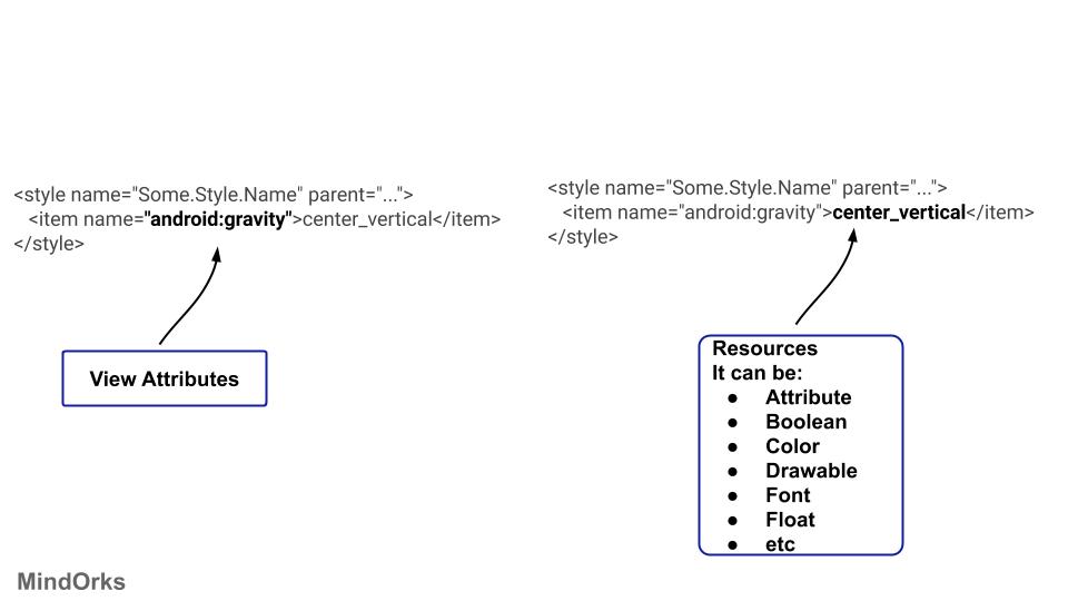
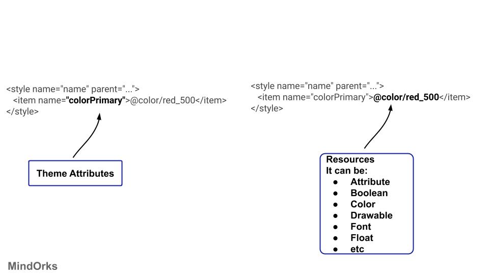
- Key-value: You can think of styles as a map because it has a key and its value. So, we have view attributes and for that view attributes, we have some values associated with it in a style. While in theme, we have theme attributes and values. Following is an example of a style:
Following is an example of theme:
Sometimes we use the ?attr/ in our code like below:
<item name="android:background">?attr/colorAccent</item>- Way of use: There is a difference between style and theme on the basis of the way they are applied in the project. If you apply some style on a view then it is just applied to that particular view only and not to its child. But on the other hand, if you apply some theme to a view then that theme will be applied to all it's child also.
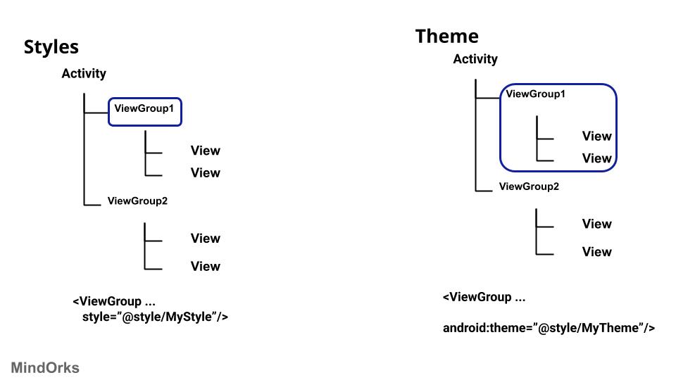
The thing to be noted: In the case of hierarchy, you have to be careful about the theme. Suppose you have one parent view named parent1 and it has two child views named child1 and child2 . The same android:background property is being used in all three views. So, which property is going to be used? In the case of hierarchy, the property of the newest child will be taken into consideration and the rest of the values of the parents will be ignored. So, in our example, the values of the properties used in the child1 and child2 will be used any the value of parent1 will be ignored.
Material Theming
So, we have seen the difference between styles and themes. Now its time to learn Material Theming.
Material Theming is used to provide a new look and feel to your application by using Material Design. You can achieve a huge range of expressiveness in your application by using Material Theming.
The Material Components themes have a number of attributes that are used to style an element on a global scale. All the attributes can be broadly divided into three categories:
- Color
- Typography
- Shape
Just by providing the values to all the above three mentioned categories, you can achieve a huge range of quality design in your application.
Color
There are various attributes related to colour in Material theming. The attributes mainly consist of primary, secondary, surface, error, and on variant of these colours. Following is the description of all these attributes:
- colorPrimary: This is the primary colour that is used for your application. This will be your base or you can say your parent colour.
- colorOnPrimary: This is used for the elements that are placed over your primary colour. So, this is in contrast with your primary colour. This very important because if you set your primary colour and the element residing on the primary colour to be same, then it will give a bad user experience because the user will not be able to differentiate between these two.
- colorPrimaryVarient: This is a slightly lighter or darker variant of your primary colour.
- colorSecondary: This is the colour that is used most after the primary colour in any application.
- colorOnSecondary: This is used when you want to set the colour of such an element that is present on the top of some secondary colour.
- colorSecondaryVarient: This is a slightly lighter or darker variant of your seconday colour.
- colorSurface: This is used when you want to set the colour of a surface. That surface can be anything like Material Sheets.
- colorOnSurface: This colour is used for the elements that are present on the surface of the colorSurface.
- colorError: This colour is used to show some error message. Generally, it is red in colour.
- colorOnError: This colour is used for the elements that are displayed on the top of the colorError.
- colorBackground: This colour is used for the content that is behind all other screens content.
- colorOnBackground: This is used for the elements that are placed on top of colorBackground.
You can use the above colours in your app theme by using the below code:
<style name="AppTheme" parent="Theme.MaterialComponents.Light">
    <item name="colorPrimary">#0336ff</item>
    <item name="colorOnPrimary">#ffffff</item>
    <item name="colorPrimaryVariant">#0035c9</item>
    <item name="colorSecondary">#ffde03</item>
    <item name="colorOnSecondary">#000000</item>
    <item name="colorSecondaryVariant">#ffc000</item>
    <item name="colorSurface">#ffffff</item>
    <item name="colorOnSurface">#000000</item>
    <item name="colorError">#b00020</item>
    <item name="colorOnError">#FFFFFF</item>
    <item name="android:colorBackground">@color/background</item>
    <item name="colorOnBackground">#212121</item>
</style>
If you are finding it difficult to get correct secondary colour for your primary colour or anything related to colours, then you can use the Material Color Tool .
Typography
Whenever you are using some text in your application then you should use some pre-defined type scale that is recommended for Material Design. So, you don't need to write code for different text for different screens. All you need to do is just use the type scales defined by Material Design.
Various type scales that can be used are:
- textAppearanceHeadline1: Light, 96sp
- textAppearanceHeadline2: Light, 60sp
- textAppearanceHeadline3: Regular, 48sp
- textAppearanceHeadline4: Regular, 34sp
- textAppearanceHeadline5: Regular, 24sp
- textAppearanceHeadline6: medium, 20sp
- textAppearanceSubtitle1: Regular, 16sp
- textAppearanceSubtitle2: Medium, 14sp
- textAppearanceBody1: Regular, 16sp
- textAppearanceBody2: Regular, 14sp
- textAppearanceCaption: Regular, 12sp
- textAppearanceButton: Regular, 14sp, all caps
- textAppearanceOverline: Regular, 12sp, all caps
To use this in your code, you can use as below:
<TextView ...
    android:textAppearance="?attr/textAppearanceBody1"/>
If you want to customize any of the Material Components text appearance styles, then you can do so by:
<style name="AppTheme" parent="Theme.MaterialComponents.Light">
    ...
    <item name="textAppearanceHeadline1">@style/AppTextAppearance.Headline1</item>
</style>
Shape
To use shapes in your application, there are certain guidelines that must be followed. The shape can be divided into small, medium, and large shape types. For the corners of a shape, you can use either rounded corners or cut corners. Apart from this, you can set the corner radius and also you can set which corners are to be made rounded. All the corner related things are done in " cornerFamily " attribute.
As discussed earlier, the following are the shapes that are recommended in Material Design:
- shapeAppearanceSmallComponent : This is generally used for small components like Buttons and chips.
- shapeAppearanceMediumComponent : This is used for medium size shapes like cards.
- shapeAppearanceLargeComponent : This is used for large shapes like bottom sheets.
You can customize the above three in the same way as done in the case of typography.
Dark Theme
When Android 10 was released then the most popular and trending thing after the name of the Android version was the Dark Theme. This is made available in Android 10 or API level 29. By using Dark Theme, the power usage of the mobile will be increased and the users can use the application in a low-light environment also without putting stress on the eyes.
To use Dark Theme in your app, you need to set your app's theme to inherit from a DayNight theme:
<style name="AppTheme" parent="Theme.AppCompat.DayNight">If you have upgraded the App theme to MaterialComponent, then you can use:
<style name="AppTheme" parent="Theme.MaterialComponents.DayNight">Apart from the Dark Theme, your users can change the theme of the app while using them. The available options are:
- Light Theme
- Dark Theme
- Set by Battery Saver (the recommended default option for Android P or before)
- System default (the recommended default option for Android Q).
Now, to update the theme dynamically we have to use,
AppCompatDelegate.setDefaultNightMode(/**Your Mode**/)Example,
object ThemeHelper {
    private const val lightMode = "light"
    private const val darkMode = "dark"
    private const val batterySaverMode = "battery"
    const val default = "default"

    fun applyTheme(theme: String) {
        when (theme) {
            lightMode -> AppCompatDelegate.setDefaultNightMode(AppCompatDelegate.MODE_NIGHT_NO)
            darkMode -> AppCompatDelegate.setDefaultNightMode(AppCompatDelegate.MODE_NIGHT_YES)
            batterySaverMode -> AppCompatDelegate.setDefaultNightMode(AppCompatDelegate.MODE_NIGHT_AUTO_BATTERY)
            default -> AppCompatDelegate.setDefaultNightMode(AppCompatDelegate.MODE_NIGHT_FOLLOW_SYSTEM)

        }
    }
}
So, we have seen how to implement a Dark Theme in the Android app. But are we done with that? No. Let's take an example. Suppose, we are having an app that has few texts written on it using some dark colour. Then if you change the theme of your app to Dark Theme, then there might be some cases when the theme will be changed to dark mode and the text is still in dark colour. This will provide a very bad user experience because the dark text on the dark theme is unreadable.
The reason behind this is the hard-coded colours in our styles or in our layouts, something like this:
<TextView ...
    textColor="#000000" />
So, always prefer to use theme attributes for colours.
<TextView ...
    textColor="?android:attr/textColorPrimary" />
In general, the primary colour should be like a mid-toned colour but in the case of Dark Theme, your primary colour should be a desaturated lighter version. So, it doesn't have that much contrast.
Don't use bright colours for large surfaces because they emit too much brightness.
To find which colour is suitable for primary colour in general case and in Dark Theme, you can use the Material Colour Tool .
Closing note
In this blog, we learned how to use the Material theme and Dark Theme using Styles in Android. For more information on Material Theme, you can visit the Material Design website .
Hope you learned something new today.
Have a look at our Android tutorials here .
Do share this blog with your fellow developers to spread the knowledge. You can read more blogs on Android on our blogging website .
Apply Now: MindOrks Android Online Course and Learn Advanced Android
Happy Learning :)
Team MindOrks!